Harry Potter’s Visual Identity
Redefining one of the most beloved franchises of all time.
▼
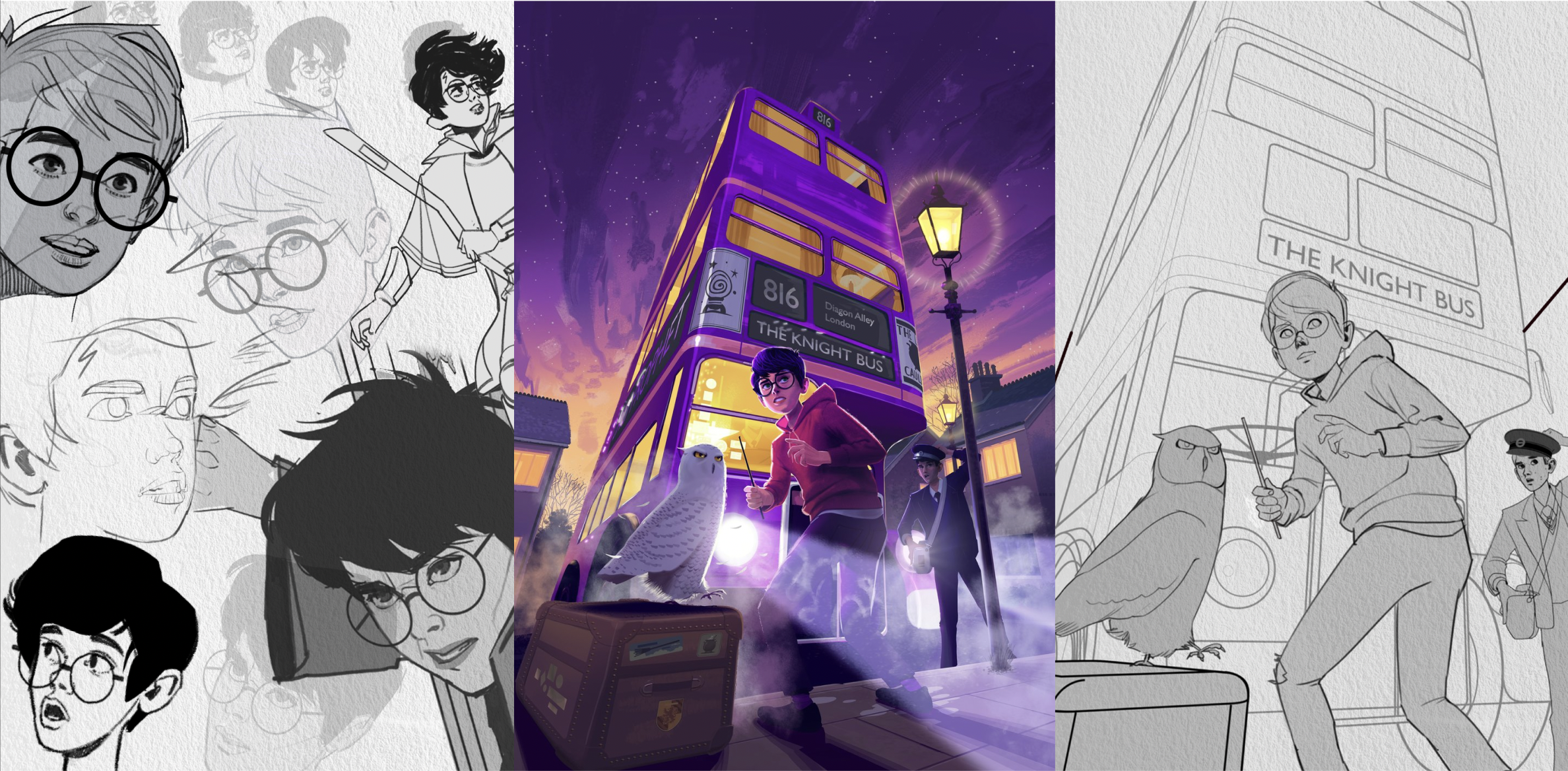
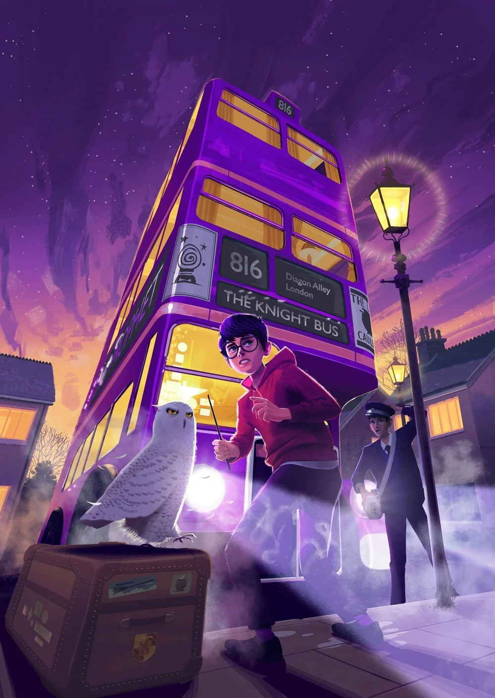
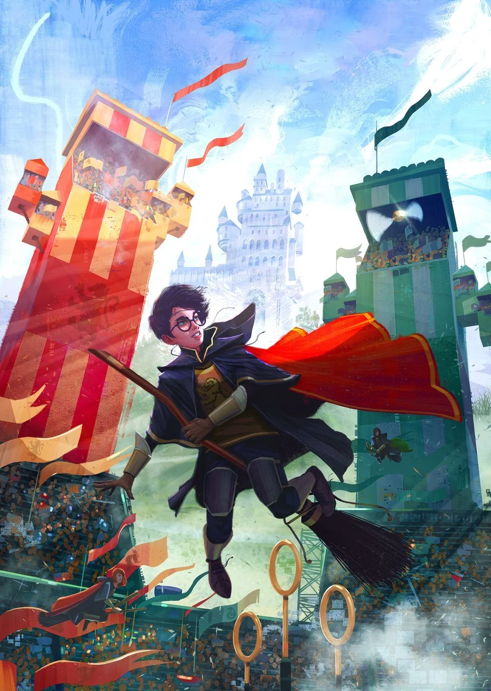
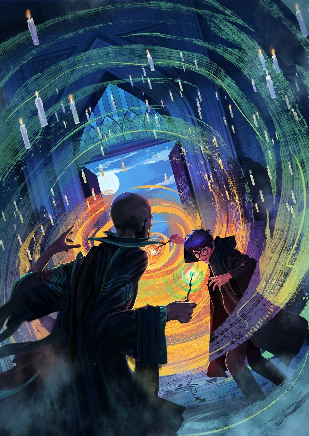
To celebrate the 25th anniversary of the franchise, we needed to create a new global, visual identity for the most iconic children's book in the history of publishing.
This illustrative style should inspire a new generation of readers whilst retaining brand loyalty within the worldwide fan base.
“This modern take also captures a whole host of scenes that have never been featured on the covers before.”
Amy Houston, Senior Reporter | The Drum
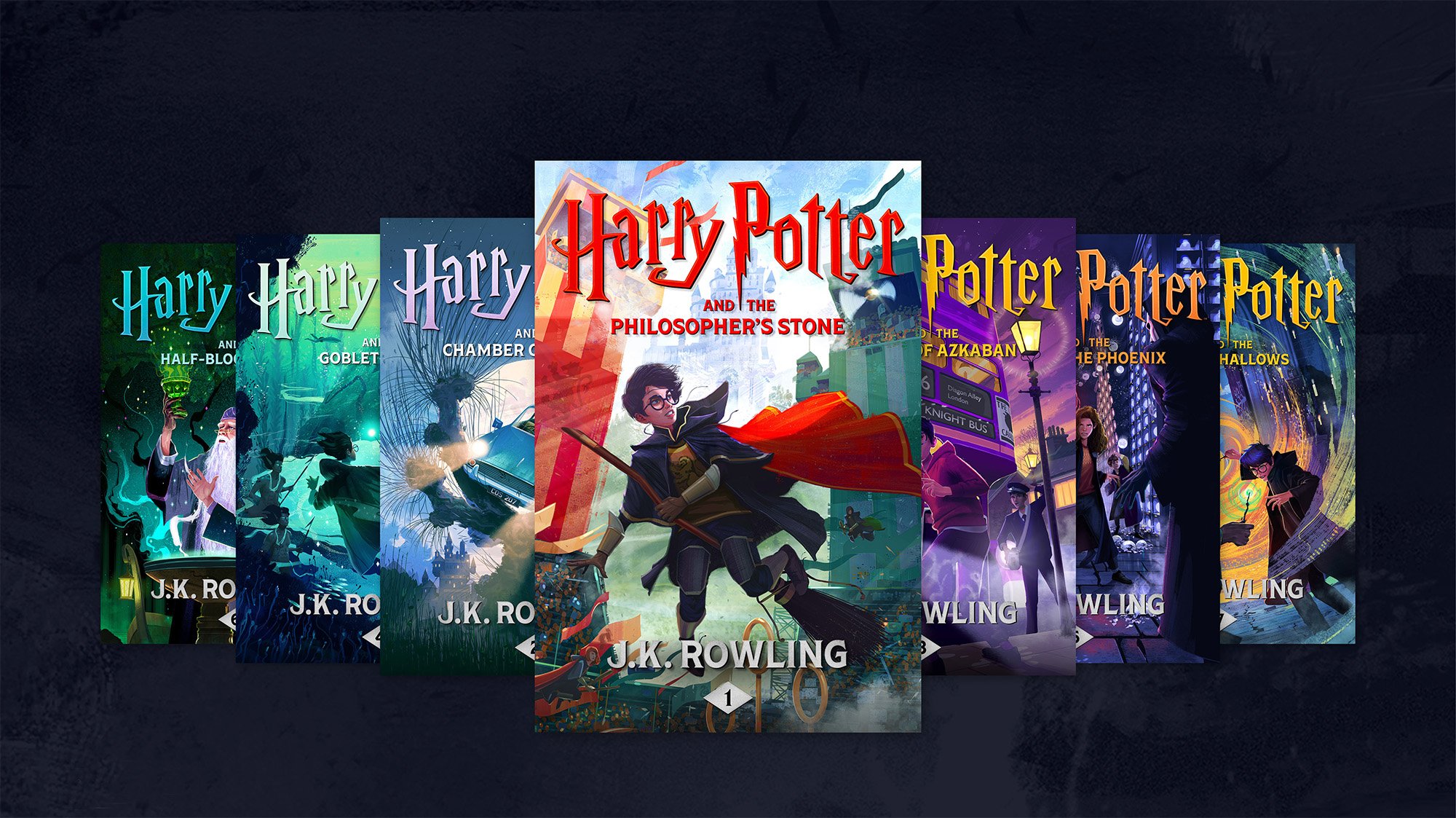
Our creative began with in-depth audience insights. We uncovered the core emotional themes that fans feel are at the heart of these stories, and used them to inform our visual direction.
With both the covers and marketing collateral in mind, we found the perfect balance of familiarity and newness in our assets, so they could resonate with every generation.
The new look and feel was made to flex across the entire digital publishing landscape with our illustrated covers at the centre.
